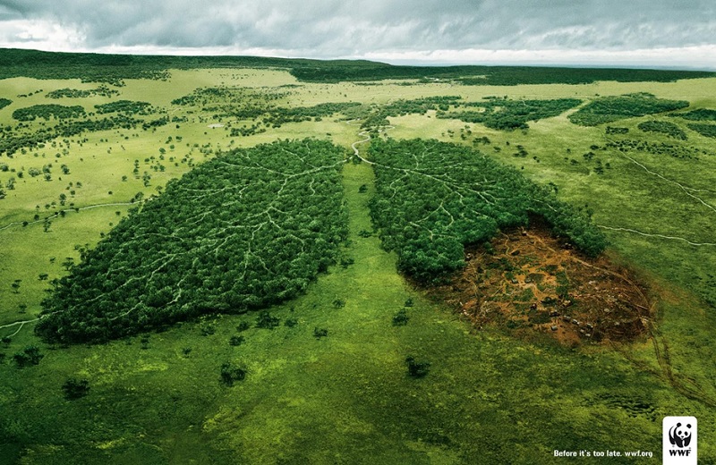
Great Ad 21: Before It’s Too Late
I went “wow” when I first saw this advertisement, it hits the nail right on the head.

Through “Lungs”, WWF France reminds us how greenery impacts our body and health. Visually, the art direction is stunningly well executed, so much so that TBWA can even afford to lose the tagline “Before it’s too late” without fear of losing the meaning. The ad is simply self explanatory.
I believe the ad has served it’s purpose and this is why I was a little irked when some creative folks were so quick to bombard it.
Yes, the idea may not be very original, but it is the truth, isn’t it? Without trees on our planet, our life will be devastatingly changed for the worse. Can you imagine a world without tree and we have to wear an oxygen mask? So what’s wrong with it being a “regular idea”? Why the sarcasm “Heck, why not skip the whole ad and save some trees!!!!”? Why ridicule and call it a “cartoon idea”? Are these folks shooting arrows simply for the sake of having something to criticise? Feedback is useful when it is constructive, with clear indication about why it is flawed and offers a plausible solution to make it better. Mindless criticism and bombardment will not help to improve the standard of advertising.
What’s the fundamental function of an advertisement? It is to put across an intended message specifically and clearly to a large mass audience without them misunderstanding and misinterpreting. As far as I can see, the “WWF Lungs” ad has achieved that.
If there is any flaw with “Lungs”, I have to agree with what Stevil shared
…. it might be lost on a percentage of the public who are not familiar with the World Wildlife Foundation… When I first looked, I thought it was an anti-smoking campaign or for lung cancer.
Still, if the public is curious enough to know who or what WWF is, it’s on them to check it out.
I like this ad. That’s it.
4 Replies to “Great Ad 21: Before It’s Too Late”
Great art direction and good idea. I wonder how it’s possible for them to execute this idea.
Thanks for sharing the ad!
Actually I didn’t understand art very much. But The pictures you given is fantastic.
Awesome development of the picture, is so explicit, the message is caught effectively.
Yes, it is magnificent, which is why I was irked when some folks dismissed it simply because it is not an original idea. Honestly, how many ideas out there is 100% original?