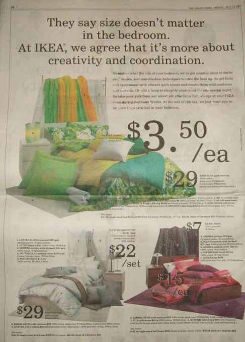
Lousy Ad: The Photo Does Matters

I’m a fan of IKEA’s print advertisements.
I also have many IKEA’s creations in my house and office.
So I was somewhat surprised to see this ad from the famous Swedish furniture and furnishing house.
IKEA’s furniture is sleek and streamlined, and more often than not, its print advertisements mirror the same look and feel.
Not this advertisement though.
I couldn’t believe my eyes when I first saw this ad.
Messy.
Untidy
Poor choreography.
Ironically, the headline said “… it’s more about creativity and coordination”.
I can see the effort involved in the selection of bed sheet, quilt cover, pillows, cushions, lamp shade etc from the green, white and red bedroom collection. There is certainly creativity in there and no denying the excellent colour coordination.
What I cannot see is the “creativity and coordination” in the art direction. The impression of messiness and untidiness seen on the newspaper does not jell well with the sleek and streamlined feel found in the gigantic store. What I get in the store is not what I see on this advertisement. Fortunately for IKEA, the store is better.
Usually, advertisers take pains to create beautiful ads that emphasize their uniqueness so as to draw customers. There are many incidents where, customers who are overwhelming impressed with the copy and photograph of the advertisement, were somewhat disappointed when they visit the store. What they see is not what they thought they can get. Yet this ad is quite the opposite.
If I did not know this ad were from IKEA, I will probably dismiss it as a “clearance sale ad” of some other store. Not an IKEA store. I have pre-conceived impressions of IKEA, that the latter has so successfully sowed and nurtured in my memory banks.
A photograph is a very strong visual element to capture the attention of a prospective customer or even convert non-customers into customers. And so, we are conditioned to expect great photography from furnishing and furniture company and interior design firm. In this case, a simple effort by the stylist or photographer to properly straighten out the bedsheets and arrange the pillows nicely on the bed would have done justice to the photo shoot. Of course, unless they might be having have other ideas in their head. Whatever it was, I feel it did not work for me.
This is just my opinion. I’m sure they are people who sense the same messy feel.
13 Replies to “Lousy Ad: The Photo Does Matters”
I have to totally agree with you on this one, which is a disappointment considering how Ikea has always set the benchmark for great and impactful ads. There is too much visual clutter and too many details that distract one’s eye. The use of the words “creativity and coordination” is also rather weakly executed – coordination in particular sounds very lame and administrative.
One possible solution is perhaps to just focus on one bedroom set instead of three. This looks more like a page straight out of their catalogue!
Er, Walter, their catalogue looks much nicer. :P
Eww. Horrible. Especially the 15 and the 7 in the corner over the purple – that’s unforgivable.
The headline isn’t so good. And equally the layout and art direction too.
Certainly not the stuff (ad) expected of a such a wonderful brand you talk so great about.
Hi! I’m from the Philippines. Thank you very much for the interesting post!It’s very helpful and very informative.
Luckily WORK took over now.
the old ads like what u have posted are probably done by http://www.three60.com.sg or some ad agency.
and I have seen old IKEA print ads in Singapore CCA old award books by creative directors of those ad agencies as well. it’s quite baffling and difficult to find out who the culprit is.
SINGAPORE – Ikea has handed its creative business in Singapore to independent hot shop Work Advertising. The account was handed over to the agency without a pitch.
The furniture retailer’s creative account was previously being handled by another local agency, 360, while its media is currently being handled in-house.
from http://www.media.asia/searcharticle/2008_08/Ikea-hands-creative-account-to-Work/32381
I Agree, Very untidy.
I too love Ikea but the ad does look unlike something from Ikea. I wonder if they got a new marketing department or if they are trying something new.
Ya, sorta out of character for Ikea.
That is some killer information. Thanks for sharing. very informative.
Regards,
Business Listings|Qaumi Akhbar
For all the world, this ad looks like a mistake. It looks like it got caught in the printing press and superimposed one ad on top of another. It’s too bad because the “size matters” thing is very cute.
Well, Rufus, let’s hope that this is an isolated incident from Ikea.
The designer must be in a really bad mood to create something this bad.