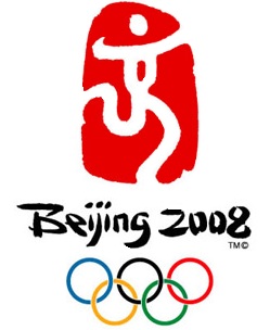
The “Wen” or Culture in 2008 Beijing Olympics Logo

I thought the 2012 London Olympics logo was not worth £400,000 and said so in an earlier post. I even made a comparison of the London Olympics logo to past Olympic logos as well as the 2008 Beijing Olympics logo. Until this post, I didn’t devote a solo post to talk about the “Dancing Beijing” emblem. I guess it’s because
– I like the Chinese seal that forms up the Beijing Olympics logo.
– I thought the usage of calligraphy text “jing” (meaning “capital”. The same word also forms the second character of Beijing) that gently morphed into a dancing athlete was a nice touch. It suits the Chinese cultural and social background. Calligraphy is not just a writing art, it is deemed extremely important in character building such that many elementary schools included it into the school curriculum.
– I believe that bright red is the definitive colour. It cannot be replaced by any other choice (not even gold, which is another auspicious colour) or other red hues. Bright Red is a symbol of good luck, prosperity, celebration, happiness and joy.
– I like the customized typography of the words, “Beijing Olympics”. The font was lively and looked animated, which made it a nice companion for the dancing athlete.
I liked it yet I didn’t write about it. On the other hand, I wrote on the London Olympics logo after it was newly unveiled. I have to admit that I had fallen into the trap of being too hasty to criticize and too slow to praise. It only occured me to write on the Beijing Olympics logo after I completed the post on “One World One Dream“, the official slogan of the game.
A quick search on the web regrettably shows that many people linked sports with a country’s political, social and foreign policies. There is a YouTube video showing a dissident hurling his body against the wall after being executed. The human imprint forms the “jing” and his blood is the idea behind the red seal backdrop. Another graphic representation shows dead Tibetian monks around the logo.
Other than the official Beijing Olympic site, it is refreshing to have Jessica Field sharing her critique on the Beijing Olympics logo at her LogoBlog. However, I like to add on one more observation:
Beside jing, the shape of the character also bears a slight resemblance to the Chinese Character “wen“, which can mean culture or language.
I believe the Chinese people would want to take the opportunity to show the world the softer side of China – their languages, art, culture and the Chinese way of life. However, will the gracious side of China change the global perception that the Chinese government is repressive and authoritative? Well, we’ll see … in August 2008.
For Olympic enthusiasts who like to keep tab on the Game, you can pop over to Don’s 2008ChinaOlympics for daily updates and video.
Of course, talk to us if you need a logo or intend to revamp one.
Additional Reading on Olympics logo and slogan:
“One World One Dream” – the official slogan of 2008 Beijing Olympics
6 Replies to “The “Wen” or Culture in 2008 Beijing Olympics Logo”
Hi Vivienne!
Thanks for letting us know what Beijing Olympics Logo is all about!
Regards
Solomon
now i knew it!!! thanks for sharing.
– 2008 Beijing Olympic Games – Pics and Wallpapers
Who knew there was so much behind the Chinese Olympic logo? I appreciate that you are sharing your knowledge and opinions with us.
Regards,
Joel
Thanks, Joel, I’m a Chinese living in Asia and the ability to appreciate oriental culture help me to lead to an enriched life in a society that is heavily influenced by foreign cultures. Yet many Chinese not only do not appreciate their culture, they are abandoning it totally. It is not wrong to embrace other cultures, however, I do not believe in forsaking our own roots totally.
This article was great to land on. I’m a Chinese guy living in NJ and haven’t been able to go back to the “mother land”. Thanks for the insight on the logo for the 2008 games. I’m always looking online for cool symbols with meaning behind them.
Hi Eddie
To have ‘insights of the logo” would mean that the founder of the company has a committed belief and mission towards his company, products and the clients he/she serves. And he must have the capability to effectively communicate all that to his marketing/brand/logo specialist, and then hopefully the specialist is able to translate all that abstract thoughts and vision into something visible. Quite a process :)