Great Ad 8: Drink Milk
I like this series of milk ads, they are really easy to understand.

Why are they good? Well, they …
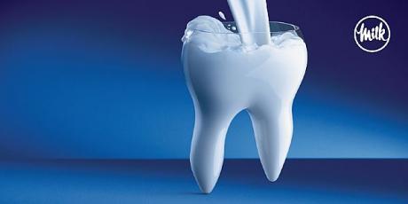
Attract Attention: White milk gushing into white bone/white tooth against a blue background with the white “Milk” logo at the top. Very distinct colour contrasts, yet juxtaposition harmoniously, making the core product, the benefits and the logo stand out prominently.
Easy to understand: Drink milk for stronger teeth and bones.
Strong product endorsement: With milk gushing and filling the tooth and bones, and the unmistakable milk logo, the message cannot be more clear. If you are wondering why the advertiser did not bother with a headline or body copy to explain milk gives calcium thus building up strong bones and teeth. Well, my take is the advertiser is paying you a compliment by assuming that you should know this if you can read the magazine/newspaper.
Check out related posts within the Great Ad series :
Great Ad 1: Without Heinz
Great Ad 2: Sony Micro Vault
Great Ad 3: Happy Father Day
Great Ad 4: Amnesty International
Great Ad 5: Ready to Quit
Great Ad 6: Forest-Woods-Tree-Death
Great Ad 7: Buenos Aires Zoo
Great Ad 8: Drink Milk
Great Ad 9: Brain, Head, Thinker
Great Ad 10: The Greatest Wonder of the Sea is that It’s Still Alive.
7 Famous Slogans of 20th Century
[tags] Milk ads, great ads, ads with few words, ads with strong imagery, ads with picture only[/tags]
One Reply to “Great Ad 8: Drink Milk”
Hi Vivienne!
This is a great ad. I liked it. The message is quite clear. Thanks for the post.
Solomon